
Framework Sports // Branding
Re-framing the branding of high quality racquet sports products, designed for professionals.
Framework Sports have been around for 28 years. They’d built up their reputation within the racquet sports industry and supply sporting equipment to distributers and professional players. However, they weren't fans of their existing logo as it was looking it’s age, and knew their branding was non-existent.
They approached us to bring their branding not only into the modern day, but to match their vision and values of becoming the no.1 supplier of all sporting goods across their industry in the next 5 years.
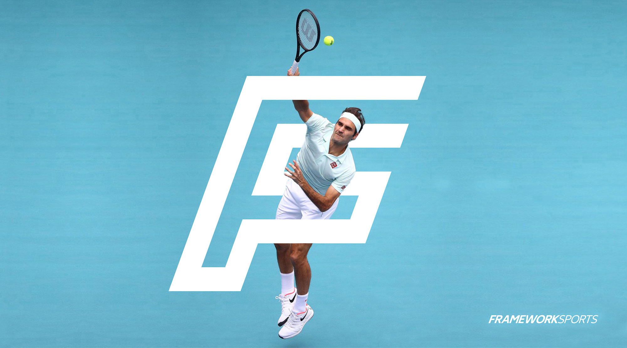
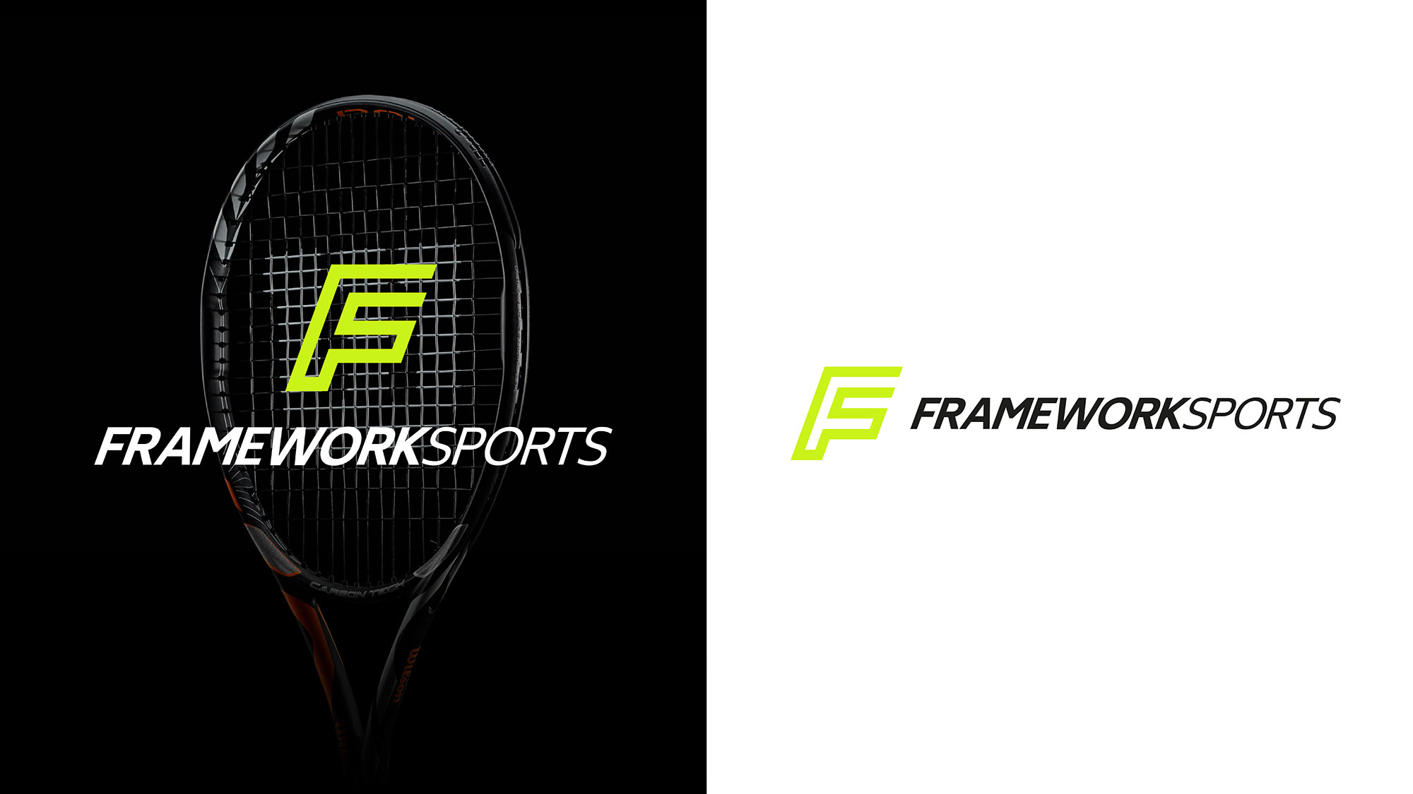
We created an energetic and dynamic monogram which reflected the corner markings of the numerous courts that Framework Sports supply their equipment for. The ‘F’ icon, reflected the cornerstone of their racquet sport heritage, but also had sport at the heart of it in the form of an ‘s’ within the F shape.
The slanted logo and italic typography conveyed the company’s passion and forward thinking nature, while the gap in the top right of the monogram represented Framework’s open and collaborative nature.
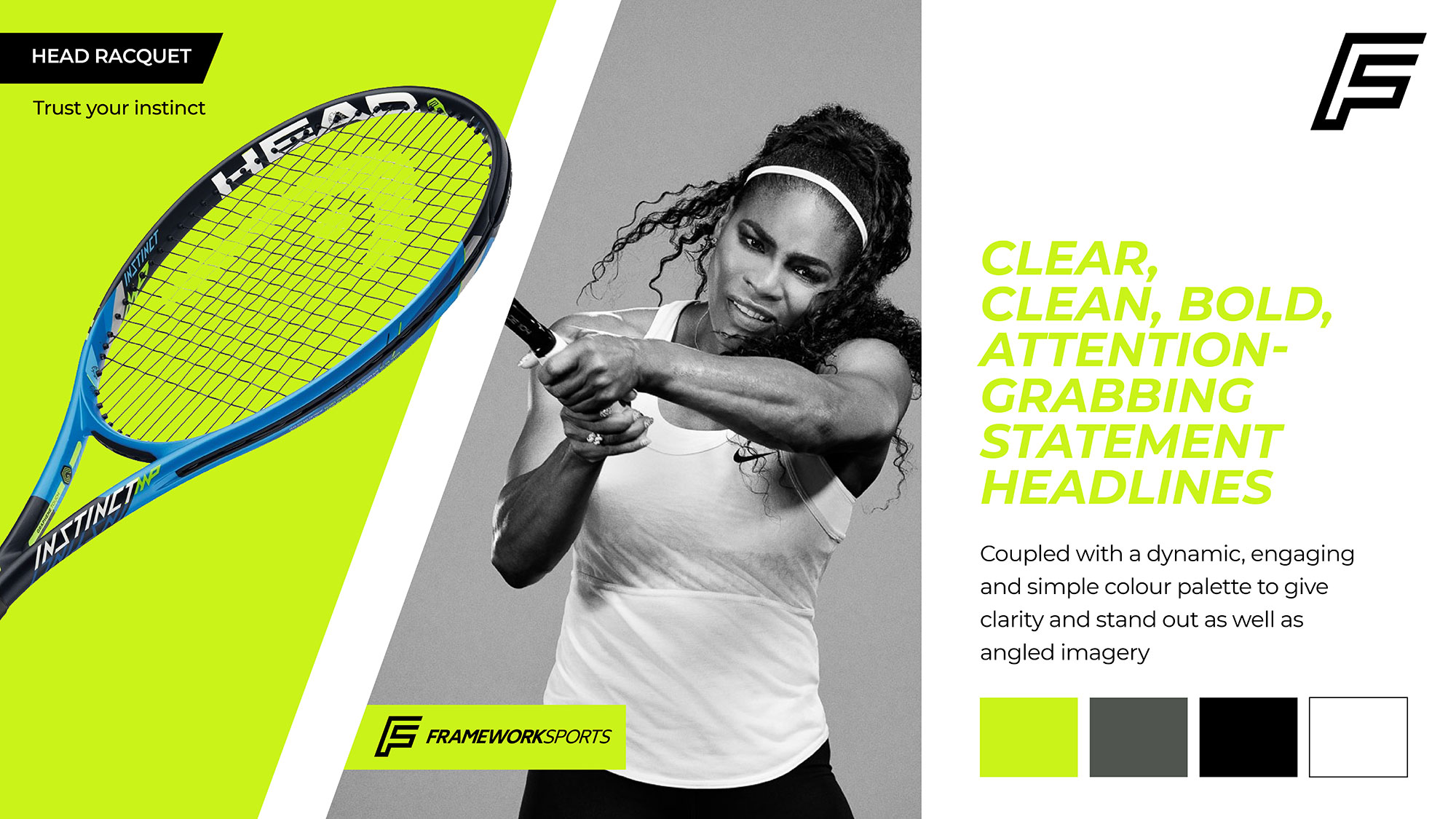
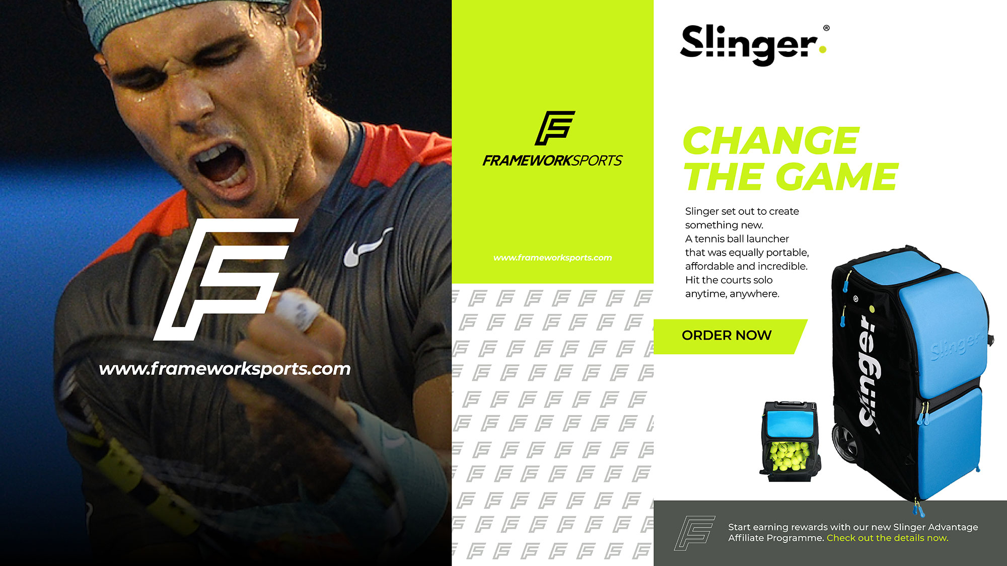
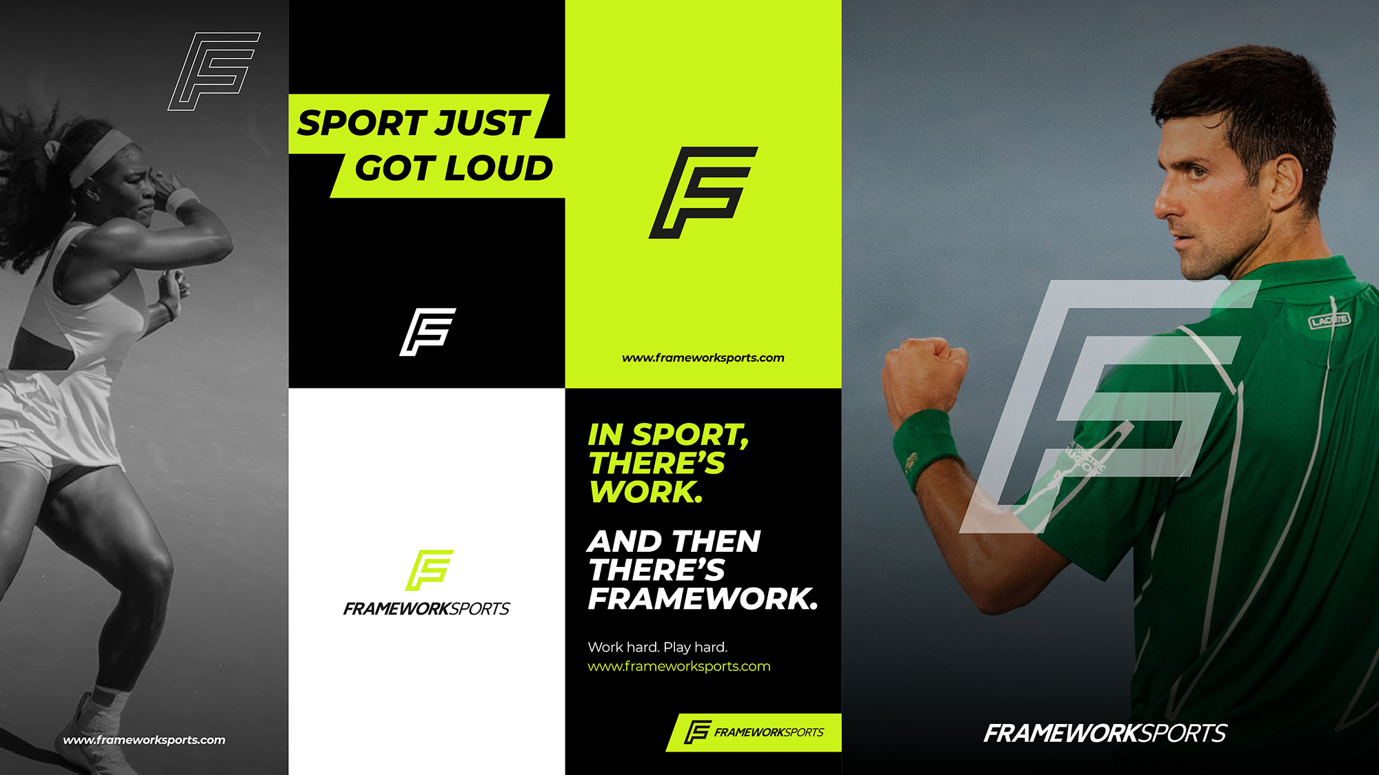
Framework Sports’ work with big brands such as Dunlop Wilson and the LTA - as well as the pro tennis players themselves - so the brand needed to be impactful enough to attract potential partner brands of this stature.
A simple but impactful colour palette and design guidelines was matched with powerful imagery. The brand was full of energy and made a statement - much to the client’s delight who predicted that "the amazing new brand will propel our business to greater heights for the next 30 years!" The branding covered all communications including web, social and print materials.
Framework Sports // Branding
Branding
Design
Creative Direction
Website
